Though predictive analytics has been around for decades, it’s a technology whose time has come. More and more organizations are turning to predictive analytics to increase their bottom line and competitive advantage. Why now?
With interactive and easy-to-use software becoming more prevalent, predictive analytics is no longer just the domain of mathematicians and statisticians. Business analysts and line-of-business experts are using these technologies as well.
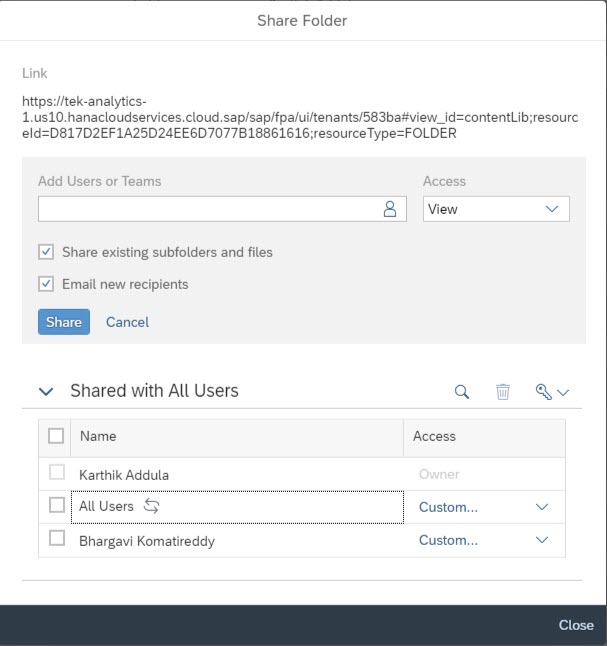
The intent of this blog is to share my understanding and opinion of predictive capabilities and options available within the SAP Ecosystem. Predictive Analytics in SAP can be leveraged with any of the below tools/applications. It all depends on how the business adopt the tools.
SAP Analytics Cloud –
It’s a cloud-based SaaS offering from SAP, capable performing of BI, Planning, and Predictive/Augmented Analytics in one place. This tool offers out-of-the-box and business-friendly technology to perform predicative use cases. SAC uses HANA APL libraries (Classification, Regression, and Time-series Forecasting)… Models where you can input the historical data and predict future outcomes. Currently, it supports both flat-file and Live (HANA) connectivity. Live connections use On-prem HANA APL installation, not the SAC APL.
There are currently 3 types of predictive scenarios available in Smart Predict:
- Classification
- Regression
- Time Series
To create and manage predictive scenarios in SAC you need a few different datasets:
- The training dataset contains the historical data your predictive model will learn from. In this dataset, the values for your target variable, which is the column related to your business question, are known.
- The application dataset contains current or new data that you would like to create predictions for. In this dataset, the values for the target variable are unknown.
- The output dataset contains your predictions and any additional columns that you have requested. Once the Model is created, SAC has added advantage of publishing the model to S4 on-prem via Pai connections.
In the course of this blog, I will create a simple Predictive scenario of Insurance Fraud using SAC Smart Predict
SAP HANA –
As everyone knows, HANA is a powerful in-memory database from SAP. Predictive Capabilities in HANA are there for quite a while through Application Framework Libraries (AFL). Below are core predictive components of HANA predictive offerings:
PAL – Algorithmic approach towards machine learning and predictive use cases. This is more suited for data scientists and IT people which requires SQL coding.
APL – Automated predictive libraries for augmented analytics to train and predict the outcome.
R/ EML Integration – Integrating with external R server for more robust and statistical use cases which requires CRAN algorithms and TensorFlow.
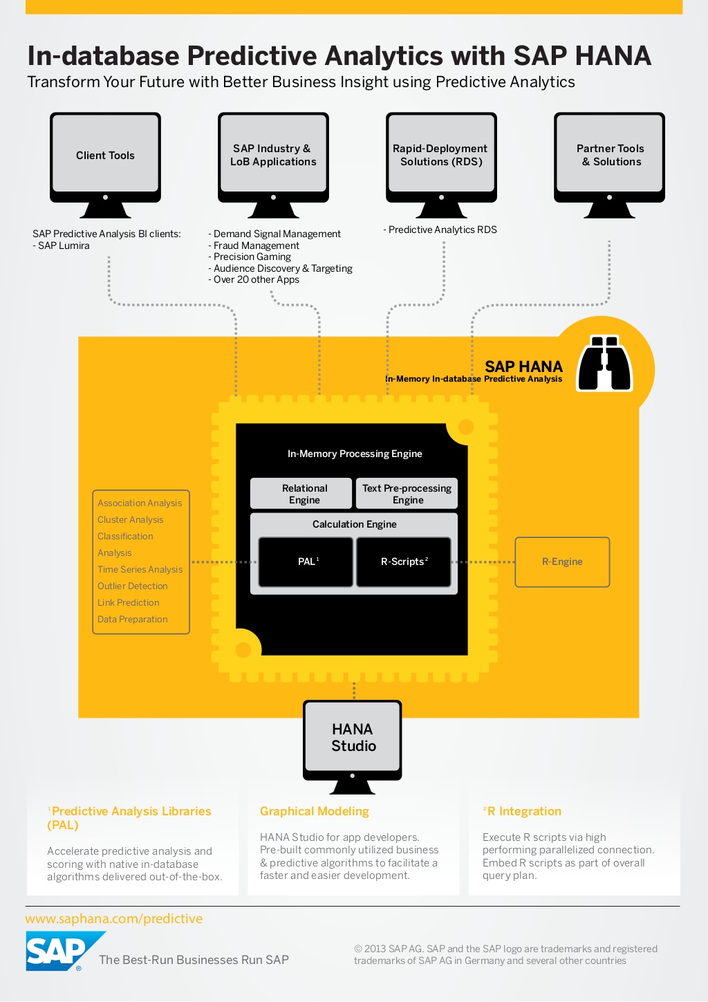
Check out the link for more information on HANA predictive (https://tek-analytics.com/site/blog_inner/28 )
SAP BW – Yes, SAP BW running on HANA has inbuilt Predictive algorithms. It uses Native HANA PAL libraries above using HAP for predictive modeling. This is best suited for industries with extensive in-house BW talent.
SAC Smart predict sample use case
Before we use the functionality, let’s look at the data we have
Data set 1 – Past insurance claims with the flag for fraud (Yes or No)
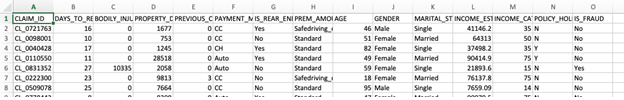
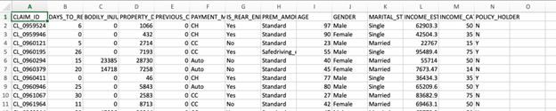
Data set 2 – Current insurance claims on which we apply the prediction
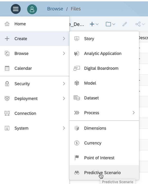
Step 1 – Create 2 datasets in SAC, Datasets can be Live on HANA tables or Flat files loaded into SAC
Step 2 – Create a Classification based Predictive scenario
Step 3 – Select Input Dataset, target variable and exclude the variables which have no impact on the outcome (Claim ID, Member name)
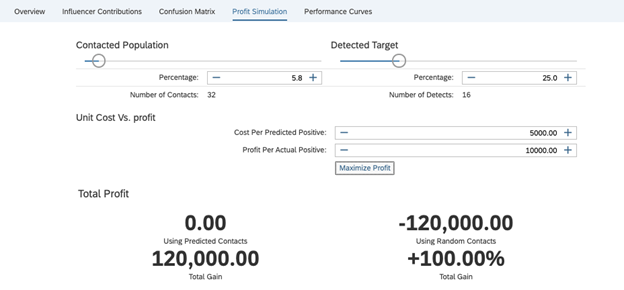
Step 4 – Train the Data set. After successful Training, SAC provides the output including Predictive power, Predictive confidence and we have an option to run Profit simulation to see where to concentrate
Applying the Model
Once we are comfortable with our Predictive Model, we can apply this to our new data set and see what it predicts
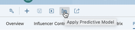
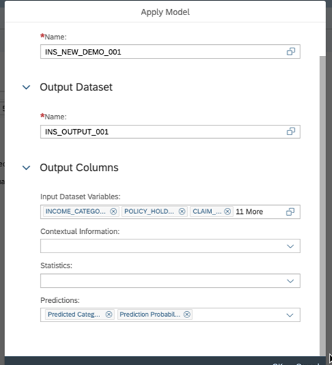
Provide, the new input dataset and Output to be created
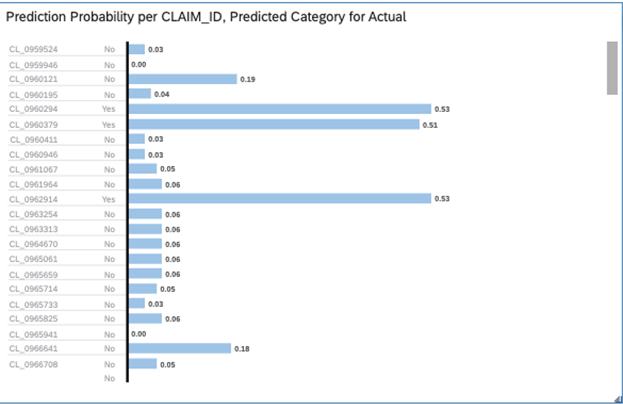
The new dataset will be now created with the name provided. The new output dataset has two additional columns created with predictive class and Probability

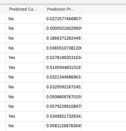
This Dataset can be in turn used for creating stories for visualizations and also, we can write back to Hana for any additional use cases.